Tag Archives: Michael Mann

Climate Research Unit servers hacked, e-mails made public

Story here are Watts Up With That. (H/T ECM)

Excerpt:

The details on this are still sketchy, we’ll probably never know what went on. But it appears that University of East Anglia Climate Research Unit has been hacked and many many files have been released by the hacker or person unknown.

This e-mail is one of the ones released:

From: Phil Jones
To: ray bradley ,mann@[snipped], mhughes@
[snipped]
Subject: Diagram for WMO Statement
Date: Tue, 16 Nov 1999 13:31:15 +0000
Cc: k.briffa@[snipped],t.osborn@[snipped]
Dear Ray, Mike and Malcolm,

Once Tim’s got a diagram here we’ll send that either later today or first thing tomorrow. I’ve just completed Mike’s Nature trick of adding in the real temps to each series for the last 20 years (ie from 1981 onwards) amd [sic] from1961 for Keith’s to hide the decline. Mike’s series got the annual land and marine values while the other two got April-Sept for NH land N of 20N. The latter two are real for 1999, while the estimate for 1999 for NH combined is +0.44C wrt 61-90. The Global estimate for 1999 with data through Oct is +0.35C cf. 0.57 for 1998.

Thanks for the comments, Ray.

Cheers, Phil
Prof. Phil Jones
Climatic Research Unit

I wonder how they will explain that.

Hot Air is reporting that CRU admits that these e-mails are genuine:

Controversy has exploded onto the Internet after a major global-warming advocacy center in the UK had its e-mail system hacked and the data published on line.  The director of the University of East Anglia Climate Research Unit confirmed that the e-mails are genuine — and Australian publication Investigate and the Australian Herald-Sun report that those e-mails expose a conspiracy to hide detrimental information from the public that argues against global warming.

The Hot Air link has more very suspicious langugage.

Related posts

Comparison of hockey stick graph data to a larger data set in the same area

I noticed this post up at Steve McIntyre’s Climate Audit.

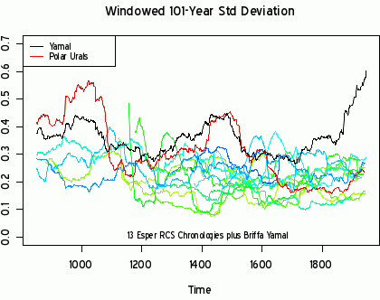
Steve recently disproved the hockey stick graph which is the cornerstone of all global warming alarmism. The hockey stick graph is based on the “Yamal” data set. It conceals the well-known Medieval Warming Period and shows a sudden spike in temperatures in the last few decades. In his latest post, Steve compares the tiny cherry-picked “Yamal” data set to a larger “Polar Urals” data set from the same geographic area.

You can click through to his analysis, but I will just show you one graph to give you an idea of what he found.

GWComparison

Wow, notice how the cherry-picked Yamal data set (in black) makes the Medieval Warming Period disappear, and adds a hockey stick upturn at the end. And notice how the larger non-cherry-picked Polar Urals data set (in red) reveals the Medieval Warming Period and no hockey stick upturn. Here is a good summary of how things went wrong with the hockey stick graph.

4500 weather records set nationwide in cold start to fall season

In other news, Watts Up With That notes that over 4500 new snowfall, low temperature, and lowest maximum temperature records where set in the USA this week. (Click to see the map with all 4500 records)

Here’s the breakdown:

Record Events for Sat Oct 10, 2009 through Fri Oct 16, 2009
Total Records: 6257
Rainfall: 859
Snowfall: 297
High Temperatures: 369
Low Temperatures: 785
Lowest Max Temperatures: 3473
Highest Min Temperatures: 474

Source: Hamweather Climate Center and NOAA/NWS

How green jobs policies have failed in Spain and Germany

Obama is planning to do “green” our economy, based on evidence like the fake hockey stick graph, and in spite of the extremely low temperatures we had in the summer and the fall this year. But how well has green jobs programs worked in Germany?

Big Government features a post evaluating of “green jobs” programs in Spain and Germany.

Consider the results of the green jobs policies in Spain.

Excerpt:

Yet in Spain, the economy suffered when efforts to create green jobs destroyed nearly 110,000 jobs in other industries according to a study released last month from Spain’s King Juan Carlos University.  It suggests that the Democrats’ plan for economic renewal through ‘green collar’ jobs may hurt the economy far more than it helps. Gabriel Calzada Alvarez, a professor of applied environmental economics, explains that Spanish citizens currently suffer from higher taxes, more public deficit and ever-increasing energy prices—all the result of the government’s efforts to create a green economy.

This report from the Rheinisch-Westfälisches Institut für Wirtschaftsforschung think tank explains what happened in Germany.

Excerpt:

German renewable energy policy, and in particular the adopted feed-in tariff scheme, has failed to harness the market incentives needed to ensure a viable and cost-effective introduction of renewable energies into the country’s energy portfolio.  To the contrary, the government’s support mechanisms have in many respects subverted these incentives, resulting in massive expenditures that show little long-term promise for stimulating the economy, protecting the environment, or increasing energy security.

In the end, Germany’s PV promotion has become a subsidization regime that, on a per-worker basis, has reached a level that far exceeds average wages, with per worker subsidies as high as 175,000 € (US $ 240,000).

It is most likely that whatever jobs are created by renewable energy promotion would vanish as soon as government support is terminated, leaving only Germany’s export sector to benefit from the possible continuation of renewables support in other countries such as the US.

You can read more about Obama’s radically leftist science czar and radically leftist former green jobs czar to understand why Obama is doing this. He is surrounded by radical extremists.

The state of the debate about catastrophic man-made global warming

This article from The American Thinker is the only article you’ll ever need to read about global warming. (H/T ECM)

It summarizes how we got to this point, the goals and role of the United Nations in global warming alarmism, and the latest finding by Climate Audit about the hockey stick graph and its curious use (abuse?) of data sets.

What the article is about:

For years, claims that UN climate reports represent the consensus of the majority of international scientists have been mindlessly accepted and regurgitated by left-leaning policy makers and the media at large.  But in the past week or so, it’s become more apparent than ever that those who’ve accused the international organization of politicizing science and manipulating data have been right all along.

Here’s a graph of global temperature, taken from a UN IPCC publication in 1990:

lambh23

And here’s what you should note about it:

And data derived from sources including tree-rings, lake sediments, ice cores and historic documents bear that position out.  Indeed, it’s abundantly evident that since the last glacial period ended, over 14,000 years ago, the Earth’s climate has undergone multi-century swings from warming to cooling that occur often and with remarkable rapidity.  And not one but three such radical shifts occurred within the past millennium.

The years 900-1300 AD have been labeled the Medieval Warming Period (MWP), as global temperatures rose precipitously from the bitter cold of the previous epoch — the Dark Ages — to levels several degrees warmer than today.  A sudden period of cooling then followed and lasted until the year 1850.  This Little Ice Age (LIA) brought on extremely cold temperatures, corresponding with three periods of protracted solar inactivity, the lowest temperatures coinciding with the quietest of the three (The Maunder Minimum 1645-1710).

And then the need for bureaucrats to control people’s lives reared its ugly head:

During testimony before the Senate Committee on Environment & Public Works Hearing on Climate Change and the Media in 2006, University of Oklahoma geophysicist Dr. David Deming recalled “an astonishing email from a major researcher in the area of climate change” who told him that “we have to get rid of the Medieval Warm Period.”  In June of this year, Deming identified the year of that email as 1995 and the source only as a lead author of that month’s Global Climate Change Impacts in the United States report.

Many believe that man to be Jonathan Overpeck – which Prof. Deming didn’t deny in an email response — who would later also serve as an IPCC lead author.  So it comes as no surprise that this reconstruction, which did indeed “get rid of the Medieval Warm Period,” was featured prominently in the subsequent 2001 TAR, particularly in the Summary for Policymakers (SPM), the highly-politicized synopsis which commands the bulk of media and political attention.

The article cites climate scientist Stephen Schneider as follows in 1989:

“To capture the public imagination, we have to offer up some scary scenarios, make simplified dramatic statements and little mention of any doubts one might have. Each of us has to decide the right balance between being effective, and being honest.”

And then adds:

Twelve years later, Schneider was a lead author of the IPCC’s TAR, the same UN report that formally introduced the delusory Hockey Stick Graph.

And that is how the United Nations began to invent the hockey stick graph, which is the latest prop supporting a made-up crisis to overturn capitalism while simultaneously providing the meaningless lives of the secular-left elite with a false sense of purpose and moral superiority. The hockey stick graph is based on the data that was debunked recently by Canadian statistician Stephen McIntyre. And now maybe we can stop worrying about global warming for good.

The rest of the American Thinker article is here and it continues to tell the rest of the story of the hockey stick graph, focusing on the role of the United Nations and IPCC researchers. This is the best article on global warming I have ever read, and it is snarky all the way through. I don’t know how the author managed to find all of those incredible quotes from the global warming alarmists planning their myths. Print and read!

My recent posts on the hockey stick graph

Share