
In my opinion, the most important thing to come out of the e-mail scandal is the source code for the graph generation program.
What does the CRU source code really say?
Here’s the source code for the file “briffa_sep98_e.pro“.
It contains this section of the code which defines an array of adjustments that will be applied to the raw data. The purpose of the adjustments according the programmers own comments (lines that start with ; are comments) is to hide the decline in temperatures, so that the graph will look like a hockey stick. In the words of the programmer, the adjustment is called a “fudge factor” and is “very artificial”.
Here’s the adjustment, called a fudge factor by the programmer:
;****** APPLIES A VERY ARTIFICIAL CORRECTION FOR DECLINE*********
;
yrloc=[1400,findgen(19)*5.+1904]
valadj=[0.,0.,0.,0.,0.,-0.1,-0.25,-0.3,0.,-0.1,0.3,0.8,1.2,1.7,2.5,2.6,2.6,$
2.6,2.6,2.6]*0.75 ; fudge factor
Line 3 creates the 20 subsets from the raw tree ring data, with each subset spanning 5 years. The subsets start in 1904. Line 4 (which wraps to the line 5) creates an array of 20 adjustments that will be applied to the raw data to change the original values. The data is stored in a variable called yrloc and the adjustments are stored in a variable called valadj.
The data is left alone from 1904-1928, adjusted downward from 1929-1943, lowered for 1949-1953 and then raised at the end.
| Year |
…….. | Fudge Factor |
| 1904 | 0 | |
| 1909 | 0 | |
| 1914 | 0 | |
| 1919 | 0 | |
| 1924 | 0 | |
| 1929 | -0.1 | |
| 1934 | -0.25 | |
| 1939 | -0.3 | |
| 1944 | 0 | |
| 1949 | -0.1 | |
| 1954 | 0.3 | |
| 1959 | 0.8 | |
| 1964 | 1.2 | |
| 1969 | 1.7 | |
| 1974 | 2.5 | |
| 1979 | 2.6 | |
| 1984 | 2.6 | |
| 1989 | 2.6 | |
| 1994 | 2.6 | |
| 1999 | 2.6 |
And then the adjustment is actually applied to the data here, and stored in a variable called yearlyadj (line 3).
; APPLY ARTIFICIAL CORRECTION
;
yearlyadj=interpol(valadj,yrloc,x)
densall=densall+yearlyadj
The true believers respond
I notice that on Science Blogs, they are claiming that the adjument is never applied because the line that applies it is commented out. But they are using the briffa_sep98_d.pro file, not the briffa_sep98_e.pro file. Someone actually pointed that out to them in the comments, but they haven’t printed a correction.
Here’s a sample comment from the post showing how the global warmists respond:
Apparently similar code appears in another snippet the results of which weren’t commented out, but still, it doesn’t matter.
Well, it certainly doesn’t matter to the mainstream media since they didn’t report the story for two weeks.
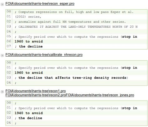
Other comments in the source code explain that data is omitted
You should also know about comments in the source code like this:
(Click for larger version)
When the missing data is added, the decline appears
Here’s the graph of temperatures with the full data set used.

There’s the decline they’re trying to hide in red.
Re-considering the hockey stick graph
Take a look at this post from JoNova which re-caps the work of Canadian statistician Steve McIntyre.
Michael Mann’s hockey-stick graph needed to be corrected:

Jo writes:
In 1995 everyone agreed the world was warmer in medieval times, but CO2 was low then and that didn’t fit with climate models. In 1998, suddenly Michael Mann ignored the other studies and produced a graph that scared the world — tree rings show the “1990’s was the hottest decade for a thousand years”. Now temperatures exactly “fit” the rise in carbon! The IPCC used the graph all over their 2001 report. Government departments copied it. The media told everyone.
But Steven McIntyre was suspicious. He wanted to verify it, yet Mann repeatedly refused to provide his data or methods — normally a basic requirement of any scientific paper. It took legal action to get the information that should have been freely available. Within days McIntyre showed that the statistics were so flawed that you could feed in random data, and still make the same hockey stick shape nine times out of ten. Mann had left out some tree rings he said he’d included.
[…]Astonishingly, Nature refused to publish the correction. It was published elsewhere, and backed up by the Wegman Report, an independent committee of statistical experts.
And Keith Briffa’s hockey-stick graph that used cherry-picked data also needed to be corrected:

Jo writes:
In 2009 McIntyre did it again with Briffa’s Hockey Stick. After asking and waiting three years for the data, it took just three days to expose it too as baseless. For nine years Briffa had concealed that he only had 12 trees in the sample from 1990 onwards, and that one freakish tree virtually transformed the graph. When McIntyre graphed another 34 trees from the same region of Russia, there was no Hockey Stick.
The sharp upward swing of the graph was due to one single tree in Yamal.
Skeptical scientists have literally hundreds of samples. Unskeptical scientists have one tree in Yamal, and a few flawed bristlecones…
The CRU e-mails also reveal that CRU “scientists” sought to marginalize and persecute (Expelled?) individuals and scientific journals that disagreed with them. Is that science? Hiding your data and methods, and threatening people who disagree with you. Is that science?
So what does the graph of temperatures really look like?
Here’s what global temperatures have really done over time:

Does this graph show that global warming is man made? Do medieval knights drive around in SUVs too much? Well, if you are getting billions of dollars of taxpayer funding, then maybe they do. Maybe the data that shows that knights don’t drive SUVs is wrong. Maybe the data needs to be adjusted to show that knights DO drive SUVs. Maybe the sample needs to be tailored to prove that global warming is man-made.
Consider Melanie Phillips writing in the UK Spectator.
Melanie cites this e-mail about the Medieval Warming Period from Phil Jones, the director of the now disgraced Climate Research Unit at the University of East Anglia.The Medieval Warming Period is a period during the Middle Ages when the Earth’s temperature was higher than it is today.
Phil Jones writes:
Bottom line – their is no way the MWP (whenever it was) was as warm globally as the last 20 years. There is also no way a whole decade in the LIA period was more than 1 deg C on a global basis cooler than the 1961-90 mean. This is all gut feeling, no science, but years of experience of dealing with global scales and varaibility.
This is the director of the Climate Research Unit at the University of East Anglia. This lab forms the backbone of the the case for global warming alarmism. Is this science? Is this how a scientist is supposed to treat the data?
Follow the money
Billions of dollars in funding are at stake.
Excerpt:
Consider the case of Phil Jones, the director of the CRU and the man at the heart of climategate. According to one of the documents hacked from his center, between 2000 and 2006 Mr. Jones was the recipient (or co-recipient) of some $19 million worth of research grants, a sixfold increase over what he’d been awarded in the 1990s.
Why did the money pour in so quickly? Because the climate alarm kept ringing so loudly: The louder the alarm, the greater the sums. And who better to ring it than people like Mr. Jones, one of its likeliest beneficiaries?
Thus, the European Commission’s most recent appropriation for climate research comes to nearly $3 billion, and that’s not counting funds from the EU’s member governments. In the U.S., the House intends to spend $1.3 billion on NASA’s climate efforts, $400 million on NOAA’s, and another $300 million for the National Science Foundation. The states also have a piece of the action, with California—apparently not feeling bankrupt enough—devoting $600 million to their own climate initiative. In Australia, alarmists have their own Department of Climate Change at their funding disposal.
And all this is only a fraction of the $94 billion that HSBC Bank estimates has been spent globally this year on what it calls “green stimulus”—largely ethanol and other alternative energy schemes—of the kind from which Al Gore and his partners at Kleiner Perkins hope to profit handsomely.
Supply, as we know, creates its own demand. So for every additional billion in government-funded grants (or the tens of millions supplied by foundations like the Pew Charitable Trusts), universities, research institutes, advocacy groups and their various spin-offs and dependents have emerged from the woodwork to receive them.
Popularizers like Al Gore would also benefit if the majority of non-scientists can be convinced that there is global warming, that global warming is man-made, and that government control of individuals and corporations is needed to fix the problem.
Here’s a simple explanation of how it works:

And the media covers up for them – they are lazy, ignorant of science, and they are overwhelmingly biased in favor of socialism.
Problems in the United States and New Zealand
Note: Christopher Horner of the Competitive Enterprise Institute is suing NASA in order to get them to release their data. And in New Zealand, climate “researchers” have been caught modifying the raw data to show global warming that isn’t there. Take a look at this UK Telegraph article that tells the story so far.
Related posts
- Climate Research Unit servers hacked, e-mails made public
- Comparison of hockey stick graph data to a larger data set in the same area
- Government-funded research unit destroyed original climate data
- The state of the debate about catastrophic man-made global warming
- Peer-reviewed article in journal Science says solar activity impacts climate
- Famous UN IPCC hockey stick graph is based on cherry-picked data
- Princeton physics professor testifies to Senate about global warming
- Global warming advocates refuse to give their data to skeptics
- Peer-reviewed article in journal Science says prior ice melting caused by solar variation
- Oceans are not warming now
- Polar ice caps are not melting now
- Polar bear populations are not decreasing now
- Global warming is not caused by humans
Consider Melanie Phillips writing in the UK Spectator.
Melanie cites this e-mail about the Medieval Warming Period from Phil Jones, the director of the now disgraced Climate Research Unit at the University of East Anglia.The Medieval Warming Period is a period during the Middle Ages when the Earth’s temperature was higher than it is today.
Phil Jones writes:
Bottom line – their is no way the MWP (whenever it was) was as warm globally as the last 20 years. There is also no way a whole decade in the LIA period was more than 1 deg C on a global basis cooler than the 1961-90 mean. This is all gut feeling, no science, but years of experience of dealing with global scales and varaibility.

2 thoughts on “MUST-READ: What does Climategate really prove about global warming?”